
In Service of the Wellspring
In Service of the Wellspring
Lane Meyer Projects
2528 Walnut Street, Denver, CO 80205 (located within PoN pOn, 21+)
March 21, 2025–May 11, 2025
Admission: Free
Review by Maggie Sava
Currently on display at Lane Meyer Projects, In Service of the Wellspring features work by Keith Riley and MarSha Yi Robinson—artists who invite us to contemplate the seasons of change passing through the cities in which we live. The botanical designs in Robinson’s CfOlNoCwReErTsE series signal the promise of a flourishing spring set against the rigidity of concrete, architectural landscapes. Riley also explores constructed environments, making geometric forms and patterns malleable with his stylized graphite, crayon, and ink drawings.

An installation view of In Service of the Wellspring at Lane Meyer Projects. Image by Erynn McConnell, courtesy of Lane Meyer Projects.
In Service of the Wellspring explores what happens when you set these artists’ compositions in conversation with one another and with the context of North Denver, which acts as the backdrop for this exhibition’s inquiry into the nuances of bounty and the echoing effects of growth.

The entrance to Lane Meyer Projects with a view of PoN pOn bar in the background. Image by Maggie Sava.
Lane Meyer Projects is located in a back room within PoN pOn, a popular bar located just off of Broadway and Walnut. While the exhibition lighting of the gallery contrasts with the dark, atmospheric lighting of PoN pOn, the murmur of conversations between the bar patrons seeps in and fills the white cube, blurring the distinction between the spaces. A table with chairs at the center of the room invites you to sit down for a while, enjoy your drink, and socialize with your companions and the art on the walls.

MarSha Yi Robinson, CfOlNoCwReErTsE #1, 2025, ink, niyodo paper (thai kozo + rayon + hamp + pulp) on 300 lb cotton paper, and photographic imagery taken by artist, 30 x 22 inches. Image by Erynn McConnell, courtesy of Lane Meyer Projects.
A detail view of MarSha Yi Robinson’s CfOlNoCwReErTsE #1, 2025, ink, niyodo paper (thai kozo + rayon + hamp + pulp) on 300 lb cotton paper, and photographic imagery taken by artist, 30 x 22 inches. Image by Erynn McConnell, courtesy of Lane Meyer Projects.
Almost directly across the room from the gallery entrance sits Robinson’s CfOlNoCwReErTsE #1, the first of a series of—as the name intertwines—concrete and flowers. In the central, asymmetrical floral composition, Robinson combines the softness of petal pastel colors with detailed, delicate line work and the solid, shadowlike quality of the stems and leaves. A frame made up of architectural photographs depicting geometrical façades of buildings surrounds the botanical images. These fragments appear maze-like with their repeating rectangular windows and have a brutalist quality in their material and angularity.

MarSha Yi Robinson, CfOlNoCwReErTsE #4, 2025, ink, silver leaf, niyodo paper (thai kozo + rayon + hamp + pulp) on 300 lb cotton paper, and photographic imagery taken by artist, 22 x 30 inches. Image by Erynn McConnell, courtesy of Lane Meyer Projects.
As writer Marsha Mack explains in the exhibition statement, Robinson creates a “balance of feminine and masculine energies, animate and inanimate, constructed vs organic” in the CfOlNoCwReErTsE series. [1] When I look at these works, it does not seem to me that Robinson is solely contrasting them as separate poles, or “this versus that,” but rather as coexisting energies that flow into one another. The flowers are not strictly gentle or feminine and do not entirely exist in opposition to the hard and calculated construction of the buildings. The plants are also rigid in their form with hard edges of their own. The hopefulness of new blooms and growth is cut through by the stem of a blue flower pointed directly down toward the floor. The interruption is abrupt, competing with the starkness of the surrounding architectural patterns.

MarSha Yi Robinson, CfOlNoCwReErTsE #6, 2025, ink, niyodo paper (thai kozo + rayon + hamp + pulp) on 300 lb cotton paper, and photographic imagery taken by artist, 22 x 22 inches. Image by Erynn McConnell, courtesy of Lane Meyer Projects.
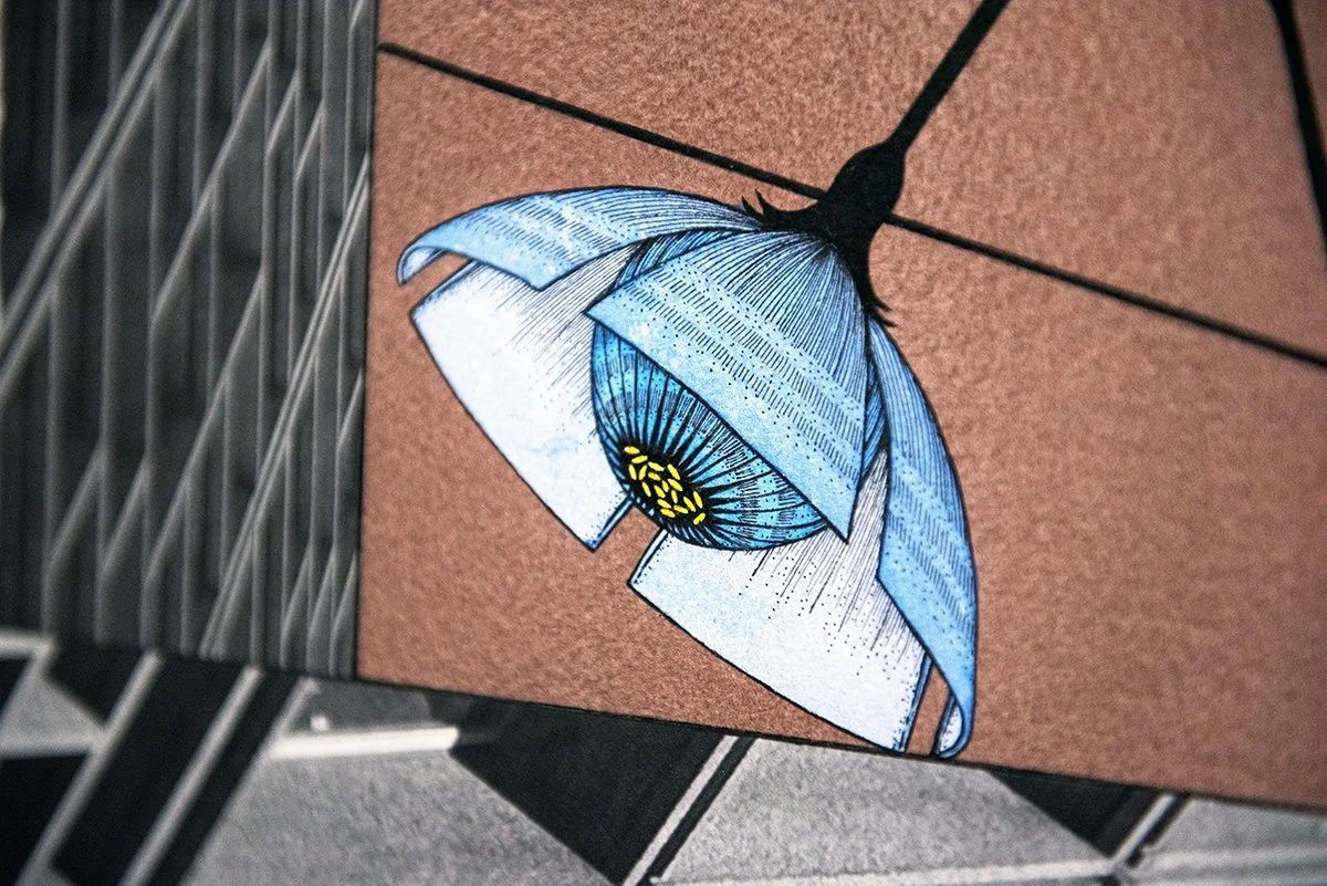
The blurring between organic and constructed forms stands out in CfOlNoCwReErTsE #6, in which a cropped photograph of a grouping of buildings sits at the center of a red and pink flower. At first, the grayscale architecture appears distinct from the vibrant, rounded petals of the floral frame. The sharpness of Robinson’s drawing also contrasts with the texture of the niyodo paper she uses for this series. Made of different pulps and fibers, the niyodo paper has a soft, irregular quality and the imperfect edges give it a natural aesthetic that does not necessarily mirror the fine line work of the flower.

A detail view of MarSha Yi Robinson’s CfOlNoCwReErTsE #6, 2025, ink, niyodo paper (thai kozo + rayon + hamp + pulp) on 300 lb cotton paper, and photographic imagery taken by artist, 22 x 22 inches. Image by Erynn McConnell, courtesy of Lane Meyer Projects.
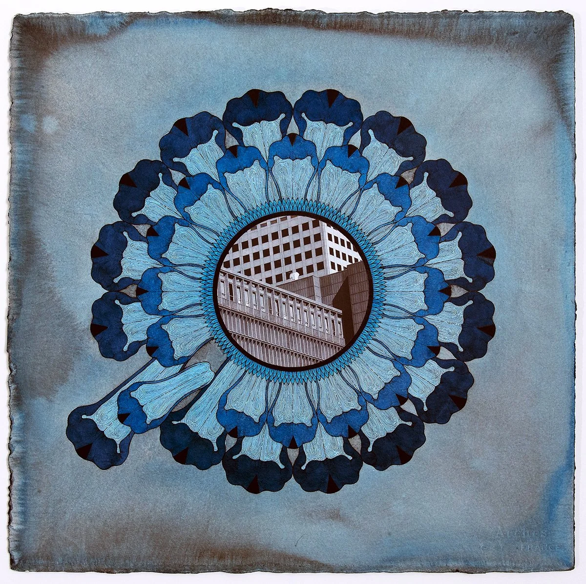
While the architectural and botanical could be seen as inherent opposites, Robinson’s attention to detail and the symmetry she captures within the flower, interrupted by one falling petal in the bottom right quadrant of the image, show how the natural world follows a certain mathematical order to promote optimal growth patterns for plants. Organic does not necessarily imply random or disorganized—for example, the Fibonacci sequence is exemplified in the natural, spiraling growth of several plants and living creatures. [2] There is still a geometric quality to the botanical elements of the images, one defined by repetition, symmetry, and regulation.

Keith Riley, Waning Welms I–XVII, 2024, graphite and lumber crayon, 15 x 12 inches each. Image by Maggie Sava.
Where Robinson juxtaposes flora and architecture, Keith Riley transforms geometric shapes and patterns into lively, permeable forms through his process of drawing with his non-dominant hand. He subverts the stable, logical nature of these shapes through their messy depiction. As Mack describes it, by surrendering accuracy and control Riley inhabits “a removed standpoint—as an outsider or a third party.” [3] I found this desire to create a sense of separation in the creative process intriguing, as the sketchy quality of the images invokes for me the presence of the artist’s hand and expressive mark-making.

Keith Riley, Waning Welms VII, 2024, graphite and lumber crayon, 15 x 12 inches. Image by Erynn McConnell, courtesy of Lane Meyer Projects.
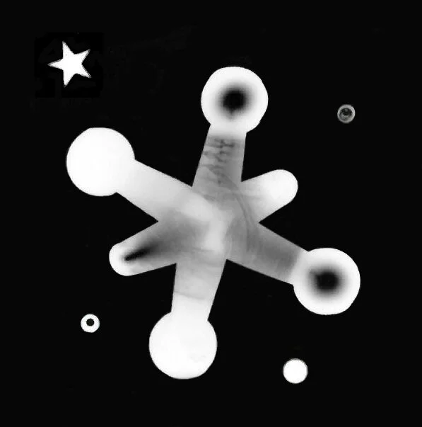
In his Waning Welms series, Riley depicts forms that resemble fountains, columns, and even vases. Lines flow out of and through them, almost like spilling water or rays of light paired with the edges of shadow. Some appear to have arm-like appendages reaching upwards. Others look animal-like, such as Waning Welms VII with circles that look like eyes sitting on either side of a long, protruding beak. Some of the drawings feel whimsical and dreamy while others feel darkier with heavier, more urgent lines.

Keith Riley, Weeping IX, 2024, graphite, crayon, aluminium, and polyisocyanurate foam, 24.25 x 24 inches. Image by Erynn McConnell, courtesy of Lane Meyer Projects.
Riley’s other drawings show similar structures defined by geometric patterns and balance interrupted and stripped down with the imprecision of their rendering. He frames them in building materials, which are dented and cut crookedly, adding to the sense of simultaneous functionality and imperfection. The use of color adds an emotional valence, like in Weeping IX, where urgent orange and yellow tones evoke flames and hot energy, matching the distraught reaction conveyed in the title of the artwork.

Keith Riley, Separator VII, 2020, graphite, crayon, ink, wax, aluminium, and polyisocyanurate foam, 23.5 x 17 inches. Image by Erynn McConnell, courtesy of Lane Meyer Projects.
For Riley, the expression of an interior state through these images is a means of conveying “the social and psychological burden of development and gentrification”—a major concern not just here in Denver but also in Brooklyn, where Riley is based. [4] While looking at these bright drawings, I think of his process of acting as an observer as he creates. The idea of separation here is complicated, especially when attempting to manifest mental and social states of being. Is Riley striving to tap into a collective psychological burden? Is he inviting viewers to examine their role as witnesses, participants, or people impacted by development and gentrification (or perhaps all three at once)?

An installation view of In Service of the Wellspring at Lane Meyer Projects. Image by Erynn McConnell, courtesy of Lane Meyer Projects.
During my walk back from the gallery, I notice how the conversation between organic form and functional architecture occurring in In Service of the Wellspring resonates with the setting of this display, within a gallery located in “RiNo” (River North Arts District), which lies in the Globeville, Elyria-Swansea, Five Points, and Cole neighborhoods in Denver. [5] Walking by the warehouses and the other industrial buildings in the area, I return to the shiny foil of Riley’s polyisocyanurate foam frames. Seeing the tall apartment buildings that have sprung up throughout the neighborhood reminds me of the uniform facades of Robinson’s CfOlNoCwReErTsE.

An installation view of In Service of the Wellspring at Lane Meyer Projects. Image by Erynn McConnell, courtesy of Lane Meyer Projects.
This part of the city has been greatly impacted by the sweeping gentrification in Denver. The chunk of RiNo in which Lane Meyer Projects is located sits within Five Points, a historically Black neighborhood with a rich cultural history. The skyrocketing popularity of the area, which has increased rent prices and led to the construction of many new residential buildings that have pushed out locals and small businesses, has made the area unaffordable for many residents.
MarSha Yi Robinson, CfOlNoCwReErTsE #5, 2025, ink, niyodo paper (thai kozo + rayon + hamp + pulp) on 300 lb cotton paper, and photographic imagery taken by artist, 22 x 22 inches. Image by Erynn McConnell, courtesy of Lane Meyer Projects.
The widespread use of the term RiNo to describe the area is felt by some members of the community to be both a mechanism and consequence of gentrification—an erasure of history and an overshadowing of the art, the music, and the vibrancy that was already there. [6] The shifts occurring in this part of the city resonate with and give urgency to the tension between the organic and constructed in Robinson’s work, exposing the differences between the natural changes in communities driven by their members versus profit-driven expansion artificially imposed by developers.

Keith Riley, Waning Welms II, 2024, graphite and lumber crayon, 15 x 12 inches.Image by Erynn McConnell, courtesy of Lane Meyer Projects.
In Service of the Wellspring, as Mack puts it, communicates how “human intervention results in abundance.” [7] While the exhibition doesn’t directly tie these themes to what is occurring in Denver or in the RiNo/Five Points area, I find that the abundance the show points to comes from connecting to a sense of place—from taking the conversation out of the gallery and into the streets. The type of energy spilling out of Riley’s frantic lines emerges from the neighborhood and through the surrounding community.
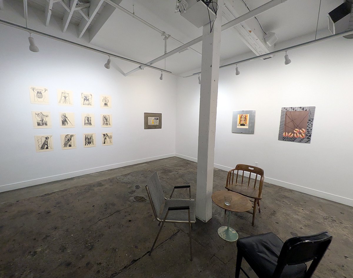
An installation view of In Service of the Wellspring at Lane Meyer Projects. Image by Maggie Sava.
When we think of the stories of growth occurring around us, are they ones of expanding blossoms or rigid, metal frameworks? Are they born from natural change or the tides of commercial viability? Seasons of change are also times to return to the people, the histories, and the familiar landmarks that are maintaining and feeding the wellsprings of our communities. There, we start our foundations for abundance.
Maggie Sava (she/her) is an art historian and writer based in Denver. She holds a BA in art history and English, creative writing from the University of Denver and an MA in contemporary art theory from Goldsmiths, University of London.
[1] Marsha Mack, exhibition statement, In Service of the Wellspring, Lane Meyer Projects, Denver, Colorado. You can read the exhibition statement online as well: https://www.lanemeyerprojects.com/in-service-of-the-wellspring-keith-riley-marsha-yi-robinson.
[2] Maddie Burakoff, “Decoding the Mathematical Secrets of Plants’ Stunning Leaf Patterns,” Smithsonian magazine, June 6, 2019,
[3] Mack, exhibition statement.
[4] Ibid.
[5] “About the RiNo Art District,” RiNo Art District, accessed April 15, 2025, https://rinoartdistrict.org/about/rino-art-district/about.
[6] For a conversation about the use of the name “RiNo” to describe this area of Five Points and how it relates to the ongoing gentrification of the area, see Gabrielle Bryant, “OPINION: ‘RiNo?’ ‘Five Points?’ Why a new name hurts in a storied neighborhood,” Denverite, August 23, 2017, https://denverite.com/2017/08/23/rino-five-points-denver-neighborhood-names/. See also Patricia Calhoun, “Is This Five Points, RiNo...or Gentrification Station?,” Westword, July 8, 2020, https://www.westword.com/news/gentrification-denver-five-points-rino-black-neighborhood-11739444.
[7] Mack, exhibition statement.


